


Color is the building block of every beautiful painting, whether it’s a bright, busy cityscape or a monotone piece. So, a basic understanding of color — and how to mix colors — is a must for any painter. Color mixing can seem a bit intimidating at first, but all it takes is a little know-how and some practice, and you’ll have the skills to level up your artwork.
In this blog, we’ll cover the essentials of color theory, explain common color terms, and share numerous tips and tricks for mixing acrylic paint.
Understanding the Color Wheel and Beginner Color Theory For Mixing Paints
If you want to learn how to mix acrylic colors, your first stop is the color wheel. A color wheel is a circular chart that arranges colors based on their relationships to one another. It’s generally divided into 12 colors which are grouped into three categories: primary colors, secondary colors, and tertiary colors. Let’s break down these color wheel terms as well as some others you’ll need to know:
- Primary colors (red, yellow, and blue): Primary colors are the base of every other color on the color wheel. No mixture of colors can ever create a true primary color. These three colors are situated opposite each other on the color wheel in a triangle pattern, with each color as one point of the triangle.
- Secondary colors (orange, green, and violet): Secondary colors are made by mixing equal amounts of two primary colors, like red and blue to make violet. These three colors are also situated opposite each other in a triangle pattern.
- Tertiary colors (red-orange, yellow-orange, yellow-green, blue-green, blue-violet, and red-violet): Also known as intermediate colors, tertiary colors are made by mixing equal parts of a primary color with the secondary color that’s next to it on the color wheel. These colors fill the remaining gaps between primary and secondary colors.
- Complementary colors: Two colors directly across from each other on the color wheel are called complementary colors, such as yellow and violet. These colors contrast strongly and stand out when placed next to each other. They also cancel each other out when they’re mixed, producing a grey, brown, or black hue.
- Analogous colors: Analogous colors are groups of three colors that sit next to each other on the color wheel and have the closest relationships. An example group of analogous colors is violet, red-violet, and red. These colors look harmonious together.
- Hue: In color theory, a hue is a pure color without a shade or tint.
- Shade: A shade is a hue that has black added to it to make it darker.
- Tint: A tint is a hue that has whited added to it to make it lighter.
- Tone: The tone of a color refers to the general darkness or lightness of a color. A single color can have an infinite amount of tones.
Using a color wheel is a quick and easy way to understand which paint colors will probably mix well together, pop next to one another, darken or lighten one another, and more.
7 Acrylic Paint Mixing Tips and Tricks Worth Trying Out
Acrylic paints are great for beginners and experienced painters alike because they’re fairly easy to use and affordable, which also makes them perfect for trying out new paint combinations. (This isn’t always the case when mixing oil paints or watercolor paints.)
Now that you’re familiar with the basics of color theory and the color wheel, you’re ready to start experimenting. You can try out the techniques and tips below on a piece of paper or color palette, or use them in your next art piece.
1. Add White Paint to Colors for More Opacity and Complexity
We mentioned earlier that adding white paint to a color makes it lighter, which probably didn’t surprise you. But white can also make a color more opaque, or solid, and it’s a great way to give the colors in your original artwork more depth.
When choosing a white paint for mixing, titanium white will be your best option. It’s especially helpful if you’re going for higher opacity since titanium white is the most opaque white available. It also has a high viscosity, which makes it easier to fully cover your painting surface.
Be mindful of how much white you’re adding to your colors though, because adding too much will turn your base color into a pastel. The number one rule of mixing is to add color gradually.
2. Add Brown or Dark Blue to Darken Paints (But Avoid Mixing With Black)
If you want to achieve a darker color, your first thought may be to add black, but that’s not the best idea. Black paint has the most pigment of all colors, and a small amount of black can darken your color very quickly, muddying it or ruining the color you’re trying to create entirely. Instead, consider mixing your color with dark blue or brown paint and add the darker color little by little.
Let’s say you’re working with cadmium red paint, which is extremely bright and has more orange undertones, and want to turn it into more of an alizarin crimson, which has a bit more purple than orange as an undertone. You can add a touch of dark blue to your cadmium to tone down the orange (blue’s complementary color).
3. Use Primary Colors to Create Different Skin Tones
This is where color mixing skills really come in handy. Nobody’s skin is a single color in every area, whether you’re painting faces, hands, or other body parts. If you’re painting people, the best way to create realistic skin is to create a family of tones around each person's base skin color.
You can start by combining equal parts primary colors (red, yellow, and blue) to create a brown color. Then, depending on skin tone, start adding in more of one color, as well as some dark blue, black, or white as needed. (Remember to use black paint sparingly, as a little goes a very long way.)
Once you have your base skin tone, create different areas on your palette with slightly different hues by adding more blue, more red, and more yellow to various sections of paint on your palette. Do the same with your white and black paint to create lighter and darker tones. Creating a variety of tones is especially important if the person you’re painting has shadows or sunlight on part of their body.
Pro Tip
Every skin tone has touches of blue, red, or yellow in them, so don’t be intimidated using those colors for skin tones. This technique for skin tones is often used in fine art but is a simple technique anyone can master.
Once you start mixing your paint colors, you’ll see how quickly the colors you’re creating look like real skin tones. Utilizing this technique will ensure skin tones in your paintings look realistic and multidimensional.
4. Add Red to Make Darker, Deeper Blues
If you’re working on a painting that has a lot of blue variations, like a deep ocean or a night sky, you may want a wide variety of blue hues so the overall effect is more detailed and true to life. Some of these colors will probably need to be fairly dark. Instead of reaching for the brown or black paint, try mixing in red.
For example, if you’re working with a solid blue color like phthalo blue and want a deeper blue color like ultramarine blue, adding red can do the trick. There may be some cases where you’ll want to add a bit of brown or black, but use that as the last step so you don’t deepen your blue further than you would like.
Remember you can always darken your color more, but going back and trying to undo a deeper hue is much harder.
5. Mix Complementary Colors for Interesting Black or Dark Shades
We mentioned earlier that these color pairings cancel each other out, making dark colors like black and gray when mixed together, and this isn’t always a bad thing! Combining complementary colors can create more unique, realistic blacks or dark shades of paint.
Try making the warm or cool black you’re aiming for by mixing yellow and violet, orange and blue, or red and green. You can use secondary colors out of the tube, like phthalo green, or start from scratch with primary colors and mix them to make the complementary colors you want to use.
In some scenarios you may prefer a flat black color, but a black with some depth and richness can tie the colors in the painting together and make your overall piece more engaging.
6. Make Your Colors a Few Shades Lighter to Account for Them Drying Darker
When mixing acrylic paints, one thing to keep in mind is that they will dry darker than they appear while they’re still wet. This is because acrylic paint has a high viscosity. So, if you’re hoping for a lighter hue, you should mix it a little lighter than you think to account for the drying and darkening process. (This is a key difference between acrylic and watercolor paints, as watercolor paints will dry lighter than they look while wet.)
You can check what your colors will actually look like when they’re dry before you embark on a full-blown painting. Create a paint swatch or color chart. All you need to do is mix your color(s), dab a little on a surface (paper, canvas, etc), label it, and let it dry.
Now, you’ll have a sample of the color you’ve mixed and what it ultimately looks like. For the most accuracy, paint your swatch on the surface you’ll paint on. So if you’re painting on canvas, make sure to create your swatches on a canvas as well.
We also suggest keeping all of your swatches and noting how you mixed them (two parts titanium white, one part crimson red). This way, you can refer back to them as needed in the future.
7. Use a Color Wheel to Get Creative When Mixing Acrylic Paints
If you’re feeling stuck or uninspired, one strategy is to revisit the color wheel. The wheel can help you identify different colors and new combinations you haven’t thought of or tried yet, and can help you create a harmonious color scheme for a particular painting.
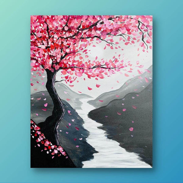
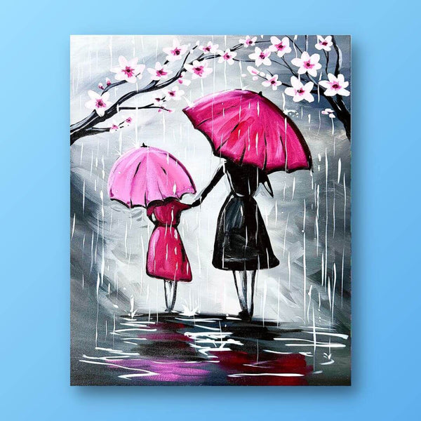
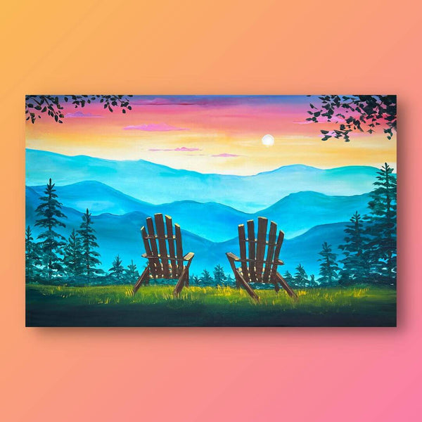
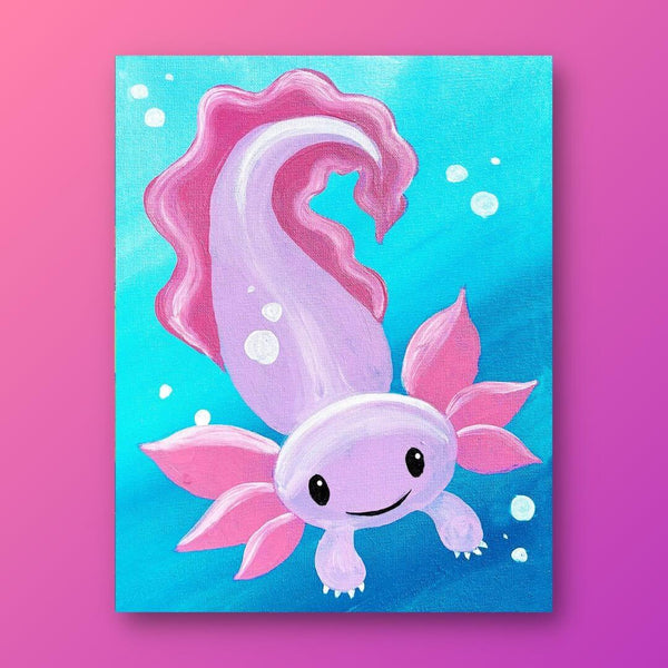
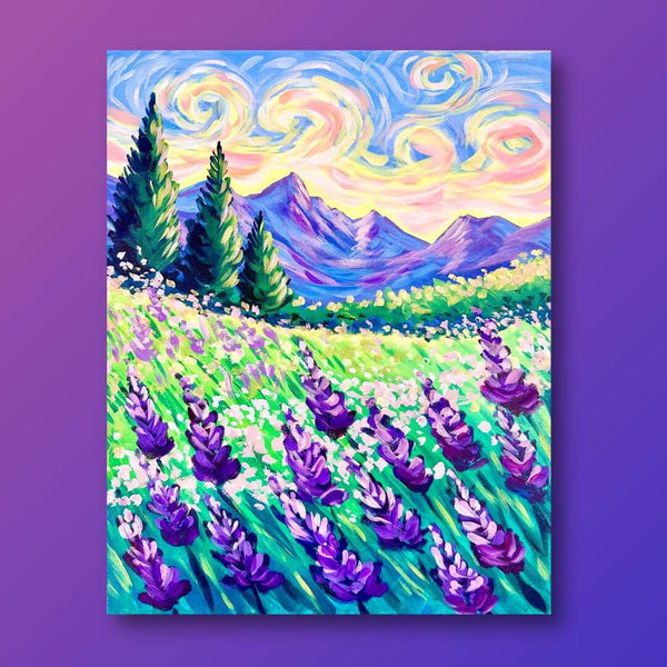
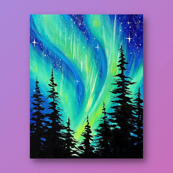
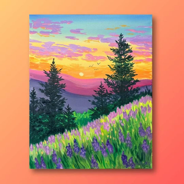
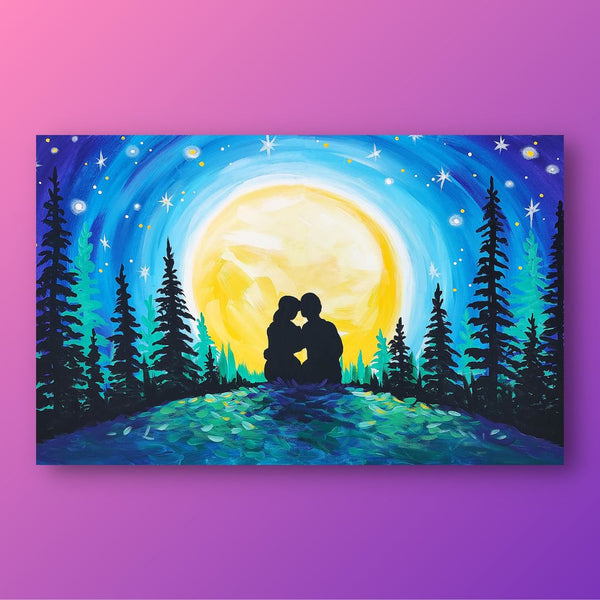
Find more inspiration in our list of 27 acrylic painting ideas.
Test Out Your New Paint Mixing Skills With Painting to Gogh!
Mixing and practicing painting techniques is vital to growing your skill set as an artist. Painting to Gogh makes it simple for you to continue building on your current skills with at-home painting kits and video tutorials.
Choose from tons of paintings and have all of the supplies delivered to your door. Check out Painting to Gogh’s collection for your next project.